
For the past decade or so, the prevailing color palette has been nothing but neutral. Increasingly, though, homeowners are opting against the whites, grays, and other dispassionate colors to make their environments cozier, brighter, and more personalized. This article from Kitchen & Bath Design explores the color statements that are on the rise.
After more than a decade of whites, grays and cool neutral tones reigning supreme in interior residential design, designers and industry professionals are celebrating the dawn of a new era – a colorful one. Experts agree that today’s homeowners are emboldened when it comes to using more vivid colors as a way to express their individual style.
As people choose to stay in their homes rather than move around, the concern over resale value and appealing to others is waning in favor of creating a comfortable, personalized oasis. And exposure to well-designed spaces is more extensive than ever, empowering consumers with the confidence to say yes.
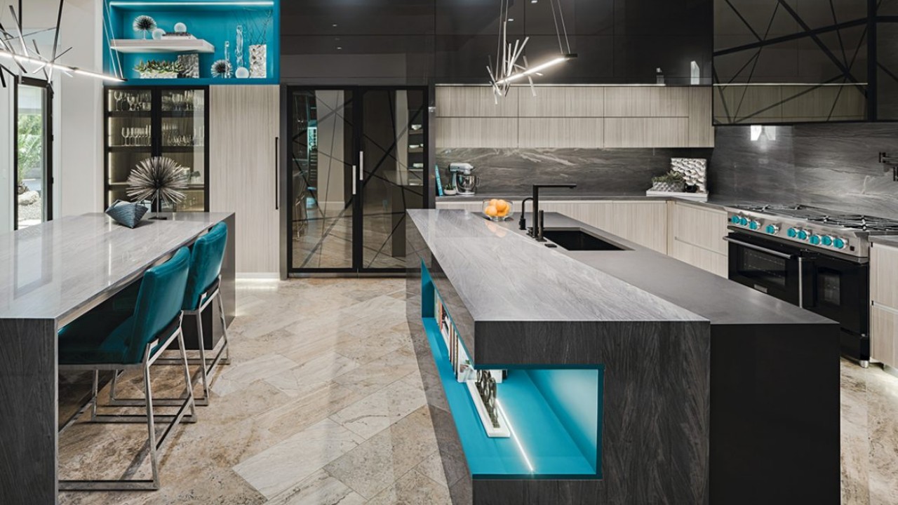
"While the classic, more restrained finishes are still the majority, clients seem less fearful about making bolder choices,” states Peter Cardamone, principal designer/partner, Bluebell Kitchens in Wayne, PA.
“I’ve been really impressed by how many people are willing to do bold color in more permanent areas,” concurs Christine Jurs, co-owner, Advance Design Studio in Gilberts, IL. “People have gotten super brave.”
She believes that this change may be partially due to the internet, with people visiting sites like Pinterest. “The accessibility of design is so much greater to the consumer than it’s ever been,” Jurs states. While 10 to 20 years ago exposure to good design was limited, “now people can see it and they want a professional designer to tell them how to put it all together,” she adds.
Gina Bauerle believes that people resist using color because it’s a risk and they’re not an expert. “They don’t see it in other houses so they feel like it shouldn’t be in theirs,” explains the partner & lead designer, D’Amore Interiors in Denver, CO. But, she adds, rooms should be designed on purpose. “People shouldn’t just pick neutrals because they’re afraid of choosing the wrong color,” she stresses.
The designer personally gravitates towards greens and the blues and is known for her use of teal. “I love those colors so much because they remind me of the ocean and water, and that’s what makes me feel calm,” she reports. Because of her love of teal it appears often in her work, and clients have picked up on that and asked for it, as well.
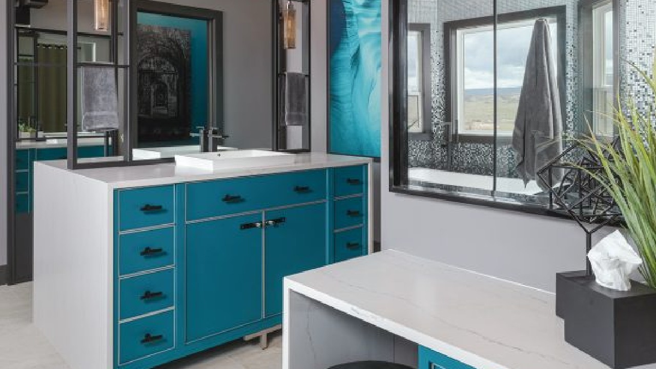
“Colors should be used based on the feelings that they generate for the individual who lives in the home,” she continues. “Their house doesn’t need to look like their neighbor’s or a hotel or a magazine layout because those spaces are attempting to appeal to the masses. That is the exact opposite of what we’re doing in a single family residential project.”
“It’s all about direction, not dictation,” emphasizes Color Marketing Group Past President Mark Woodman, owner, Mark Woodman Design+Color LLC, and color and aesthetics expert, Corian Design in Wilmington, DE.
While homeowners are embracing more vibrant colors for home design, they’re sticking to what feels comfortable and familiar.
Nature is driving a lot of trends – the woods being seen in cabinetry, the stone looks in countertops, sustainability in product, states Woodman. “We talk about the aesthetics of nature, but it’s also our relationship with nature,” he comments.
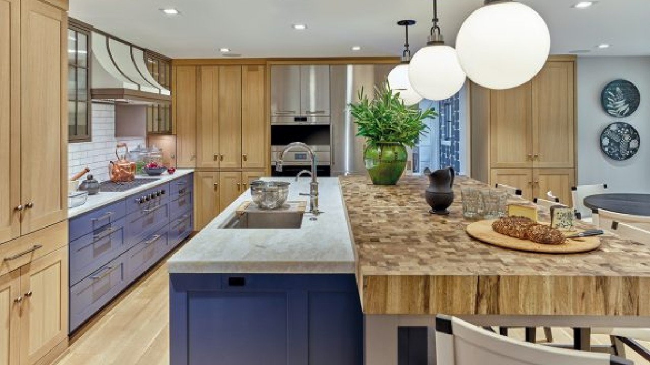
“COVID and the pandemic have given us a different appreciation for nature,” he continues. “One of the most important things during the pandemic was access to nature and fresh air, as people were sequestered in their homes. So it’s coming from a slightly different angle instead of the desire to bring the outside in. It really is about the connection we needed to have to nature in a bigger way.”
“We often look to nature and the outdoors for comfort and respite,” adds Sue Kim, director of color marketing, Valspar in Minneapolis, MN. “Popular shades and color choices in the home are more often connected to natural elements.”
With regard to the desire for colors from nature, professionals agree that blues and greens will be here for a while. “They’re nature, they’re water, they’re earthiness,” Woodman remarks.
“Comforting colors will continue to be a key design element as we transition into 2023, and green and blue offer a soothing environment with nature’s touch inside the home,” offers Kim. Valspar’s 2023 Colors of the Year – Green Trellis, Blue Arrow, Everglade Deck and Flora – feature green and blue shades.
“We’re still seeing the blues,” agrees Jurs. She notes that when homeowners started to embrace blue she thought the tones would be somewhat predictable, “but some of the blues I’ve seen are brighter than I would have anticipated, more optimistic. People want the color but they want that optimism in their spaces. I’m interested to see how it turns moodier, deeper and earthier.”
“Organic colors and materials continue to inspire a sense of comfort and wellbeing, making the calming blues and greens a popular choice,” adds Arianna Cesa, associate manager of Color Marketing and Development, Benjamin Moore & Co. in Montvale, NJ. “In addition, as we move towards the post-pandemic life, the ‘return to hosting’ has homeowners turning to their creative sides. A shift towards warm, earthy hues infused with bold and statement-making colors combines the reassuring familiarity with refreshing newness.”
One of those warm, earthy shades is Raspberry Blush, Benjamin Moore’s Color of the Year for 2023. The vibrant tone is a mix of red and yellow and delivers a vibrant burst.
“Nature is always the influence for color, but more bold vibrant natural colors are being featured in 2023,” agrees Cardamone. “Farrow and Ball’s India yellow, Inchrya blue and their deep eggplant Paean black are colors we have started incorporating into our designs.”
Also among those bolder tones are a range of rosy clay tones, oranges, terracottas and browns. The colors are found in nature and in spices derived from the earth.
While pure white and gray have been mainstays in home design for more than a decade – especially when it comes to painted kitchen cabinets – industry professionals are applauding the trend toward warmer whites and neutrals.
“I anticipate a shift from crisp paint tones to softer, creamier shades that can pair with the variety of hues that are trending,” confirms Lori Kurnitsky, senior project designer, NCIDQ, Bluebell Kitchens in Wayne, PA. “Warm neutrals are being paired with rich, warm colors and lots of natural wood accents.”
“Creamier tones are definitely moving the needle,” agrees Victor Fernandez, project designer, also of Bluebell Kitchens. “Clients are letting their feelings guide their decisions…they want to feel relaxed in the spaces where they spend most of their time.”
Behr even selected Blank Canvas, a warm white, as its 2023 Color of the Year, notes Erika Woelfel, v.p. of Color & Creative Services, Behr in Santa Ana, CA. “It serves as a clean crisp backdrop for monochromatic looks in the home, including the kitchen and bath, and allows for pops of colors to be incorporated.”
While there is a warming trend, professionals note that white and gray will likely not fade completely. And, homeowners who want or have those colors who want to do minimal updates will need transitional colors to freshen the space.
“Maybe that’s the reason for the blushy tones,” considers Jurs. “We need to keep the gray undertone somewhere. Taupe still has that gray undertone, and can mix with the grays. It’s like a bridge color. We need it to tie these two sides – warm and cool – together.”
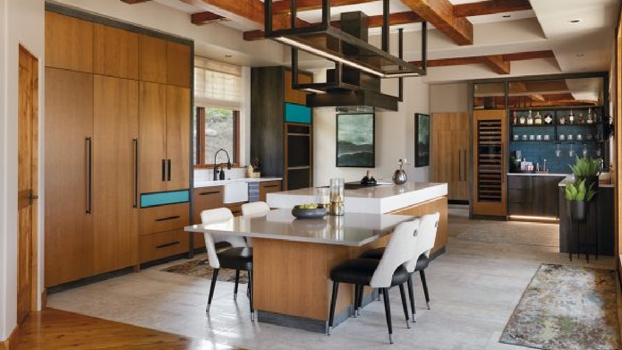
One of those blushy, warm neutrals – Redend Point – was named Color of the Year 2023 for Sherwin-Williams. Sue Wadden, director of color marketing at The Sherwin-Williams Co. in Cleveland, OH, reports that the cosmetic tone works well in the bath where homeowners practice self-care, and will also make a statement on a kitchen ceiling or cabinetry. “With brown having a larger impact on color trends, we chose Redend Point SW 9081 because the soft blush-beige is a beautiful and easier way to bring those color families into the home,” she explains.While pure white and gray have been mainstays in home design for more than a decade – especially when it comes to painted kitchen cabinets – industry professionals are applauding the trend toward warmer whites and neutrals.
Woodman agrees that browns are gaining attention. “The early adopters are starting to see this unfold and all of that brings in other warm tones, with oranges and yellows and these richer, in between colors, which also look really good with blues and greens and wood tones.”
Perhaps in keeping with the tenor of the time, dark, moody tones are also having their day. For some people, sequestering in place led to a desire to cocoon and surround themselves in rich, warm colors for comfort.
“Inherently, the colors and design are always a reflection of what’s going on out in the world, and probably moreso now than ever,” remarks Jurs, who adds that the designers on her team believe colors will get darker still. “We love the emotion of design, and I think the colors are really emotional right now, and that’s a good thing. It’s not cookie cutter,” she stresses.
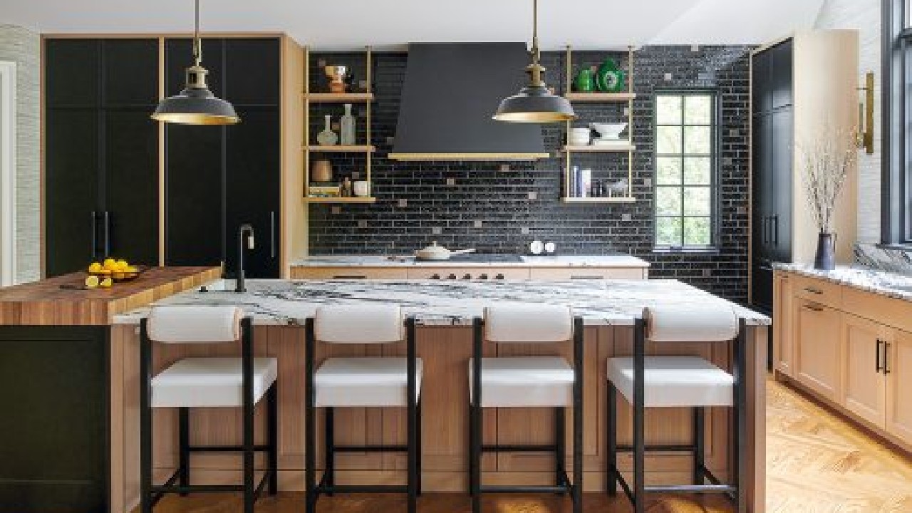
“I think we’re going to be really, really surprised by how many people ask for these dark colors,” Jurs continues. She believes navy still has a presence in the color palette, along with darker grays and texture. “People are almost in this cave phase, a hibernation phase in their homes. And they’re okay with that. They just want to be comfortable, and I think color is a huge part of that.”
And then there’s black. No longer being used as just an accent in accessories, fixtures and hardware, black is expanding into wall coverings, kitchen and bath cabinets, and countertops.
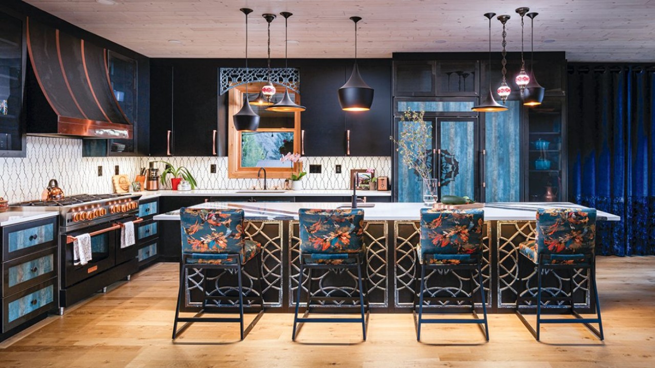
“Black has been something that I’ve been really adamant about for years,” notes Bauerle. Just as much as people think you should paint the walls in your home white, I think they should be painted black for several reasons. It’s the same concept as the little black dress. It makes all of the other colors in the space be their true self because you’re creating the biggest contrast possible.”
Woodman reports that the Color Marketing Group’s 2023 Color of the Year is black. “That was predicted back in 2021, and it was spot on,” he remarks. He adds that part of black’s success is due to the redefinition in western culture of black as positive, as strong, as having depth and intelligence.
In addition to deep navy blue, charcoal gray and dark espresso brown, black will be drawing attention in 2023, believes Woodman. “We’re seeing a whole series of colors infused with black,” he contends.
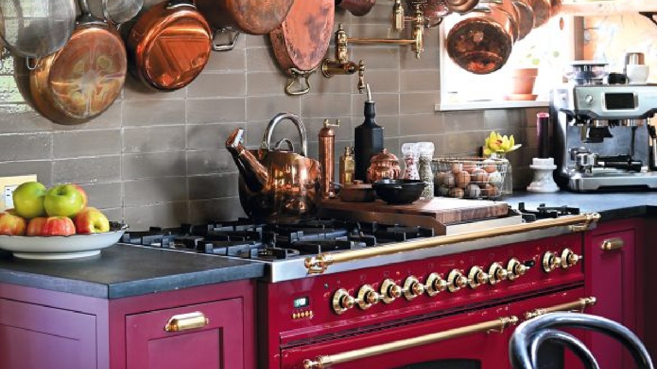
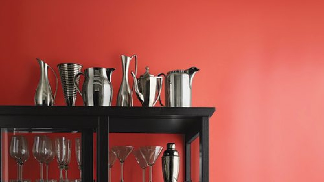
Several industry professionals believe these moody colors have given rise to Pantone’s choice for its Color of the Year for 2023 – Viva Magenta. Pantone notes that the nuanced crimson red has “an exuberance that promotes optimism and joy” and presents a balance between warm and cool.
“As virtual worlds become a more prominent part of our daily lives, we look to draw inspiration from nature and what is real,” states Leatrice Eiseman, executive director of the Pantone Color Institute. “PANTONE 18-1750 Viva Magenta descends from the red family, and is inspired by the red of cochineal, one of the most precious dyes belonging to the natural dye family as well as one of the strongest and brightest the world has known.”
“We predicted a rise in the brown and red color families, and Viva Magenta is a natural evolution from the purple of Very Peri to the warmer expression we expected to become more important in interiors,” states Wadden. “Viva Magenta marks a paradigm shift because it’s not like anything we’ve had before and it’s reflecting a new energy and a new way of being.”
“These unconventional times call for a hue that brings a shift in how people perceive their spaces and the colors within,” states Stephanie Pierce, director of design and trends at MasterBrand Cabinets in Jasper, IN about Viva Magenta. While blues and greens are becoming comfortably common, Pierce notes that colors full of vibrancy and warmth are emerging. “While color can make an appearance in many areas of cabinetry – such as accent or transitional spaces, laundry, bath and conventional areas like kitchen islands – homeowners should consider infusing such a striking hue into the central room theme to create a significant focal point when entering the space, or using it in cabinet interiors for a surprise ‘wow’ factor.”
Jurs agrees that the pinkish tones and raspberry-infused colors are transitional hues that work well with the earthy and spicy tones as well as the grays. “I also believe that when you have all of these dark, moody, earthy, emotional colors you need a little bit of something that’s happy.”
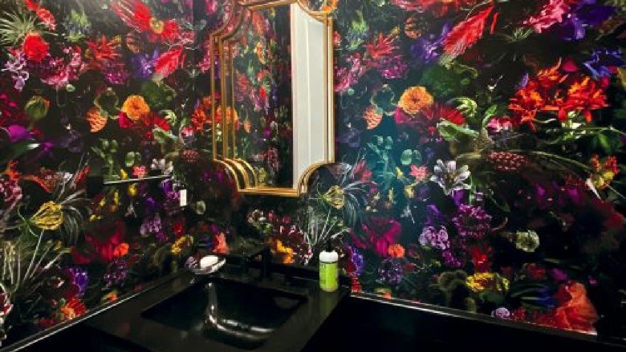
Woodman notes that, while Viva Magenta acts as that flash of light that brightens up muted tones and adds balance, he also sees it as a modern jewel tone, along with the dark blue and dark green that have been so popular. “If you lay these colors next to the jewel tones we had back in the ’90s, they’re different – they’re rich and have depth. And, they’re an interesting bridge from grays to beiges and browns.” He adds that the previous jewel tones were about opulence and wealth, while these colors don’t convey that because “the narrative has changed.”
While Jurs believes that the design industry is just beginning to explore all of the moodiness, “I see a ray of hope in all of the jewel tones.”
In essence, color choices are often a reflection of what is going on in the world, and the current array of colors is a reflection of the unpredictable status of the economy, politics and health. While some are choosing to surround themselves with the moody colors of hibernation, others want the calm and peace of soft neutrals, and still others are looking for more optimistic tones to keep their spirits buoyed. Whatever the choices, homeowners are discovering that color can influence how they feel, and are embracing the possibilities.
Ready to make your kitchen pop? Be sure to visit the wide selection at Metro Appliances & More.
Copyright © 2009 - 2024 Metro Appliances & More | Kitchen & Home Appliance Stores All Rights Reserved.
| Product | Qty | Price | |
|---|---|---|---|
| Total: $0.00 | |||
| View Cart → | |||